Well, after seeing all the potential, I’ve come to the decision that I am indeed going to reboot Starscape‘s cover. I will likely make a sort of event thingy of it towards the end of the winter, shortly before Seascape comes out. Many of you probably saw my post the other day with my projected new design. However, I discovered Derek Murphy’s (of CreativIndie) fantastic DIY cover creator today, and during a lazy afternoon did much with it – the result being that I have two designs for you to choose from!
Option One, which you saw before (and liked, according to the previous poll!)
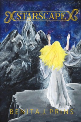
and Option Two, which is new (no need to comment on my rhyming skills)
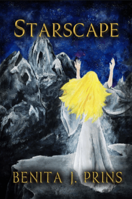
Both are beautiful, in my opinion, but I’m not going to tell which I prefer because I wanted totally unbiased votes from y’all!
Let me know what you think in the comments!

 Benita J. Thompson
I like #2 better because I don’t like the scroll around the title. Too distracting for me.
LikeLiked by 1 person
Good to know – looking at it again, I can see that the scroll might be distracting. Thanks for the comment!
LikeLike
No, Option 1 is much better. It draws you in.
In my opinion, the contrast is too harsh in the second version. Too much drop shadow. Have a look at my previous comment regarding blending and light flare.
The first cover would look great on the shelf. It’s delicate and compelling. It sets the imagination wandering whereas the second is overly brash. The twinkle of the star compared to a flare.
LikeLiked by 1 person
What if I were to take elements from both covers – say the shading around the edges, the drop shadow, and the deeper colours in the painting, from Option 2, and add them to Option 1. I love certain elements of both covers myself, and maybe that would be a good compromise.
Thanks again for all your feedback! This is why I’m posting all these covers in the first place so I’m really grateful for the critical comments. 🙂
LikeLike
I voted for number two. Bolder. Nice cover. Good job!
LikeLiked by 1 person
Glad you liked it, as that was my favourite too!
LikeLiked by 1 person
I like the contrast in the second one. It really makes the words stand out more and gives the whole look a more serious, grounded, real feel if that makes any sense.
LikeLiked by 2 people
Yah, I get what you mean. It looks a lot more like an epic fantasy cover.
LikeLiked by 2 people